
Feminine. Sophisticated. Gentle. Transgressive. Bold. Pink has a history of being a colourful curiosity.
In the 18th century, the hue was adopted by the European bourgeoisie as a symbol of luxury and class, particularly for aristocratic boys due to its reddish tint and its masculine, military undertones. Fast-forward to the 20th century and pink becomes a colour of contention. Due to branding and marketing, pink becomes gender-coded by the 50s, exclusively reserved for a delicate femininity, before receiving a fuchsia facelift in the 1960s Pop Art movement. Today, pink is a worldwide symbol of strength, survival, and even androgyny.
Ever since Margot Robbie hit our screens with the release of the Barbie movie (2023), pink has been launched into popularity. From fashion to homeware, the pink revival is in full swing.
When it comes to our interiors, pink has appeared in the form of panelled walls, faux fur cushions, abstract artwork, and statement furniture. Transforming homes into a playful space for grown-ups and embracing the uplifting and serene qualities of the colour, we’ve rounded up our favourite pink interiors, as well as the ultimate styling tips for a magenta makeover from interior stylists and influencers.
Pink & Green

“Pink is the colour of love, kindness and femininity, with the paler pinks like dusky pink, baby pink and blush being my favourites. It is a very versatile colour and goes well with many shades, green and blue in particular. Green and blue tones can often be very strong and dominant in a colour scheme, so I think pink helps soften the room and look and create a calmer space. It feels fresh and immediately makes you feel connected to nature, especially when it is paired with green.”
Using our Knightsbridge bed in Jade smart velvet, Melanie cultivates a beautiful contrast to her pink bedroom décor. Introducing a statement colour, such as green, is a spectacular way to create balance and interest within an interior space.
“I always get amazed by the amount of messages I get about using pink. I have so many women say that their partner or husband will not agree to having pink in a room and they want to know how to get around it. The trick is to start small and go for a lighter, almost greyish tone of pink like Farrow & Ball Peignoir. Match this with dark blue velvet sofas and wooden furniture and I’m certain that the stigma of using pink will quickly vanish! Light pink has such a calming presence, it would be difficult to dislike it! You could then, potentially, add more pink in art and soft furnishings.”


When it comes to styling with shades of pink, Melanie’s top tip: keep it light.
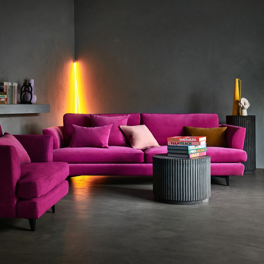
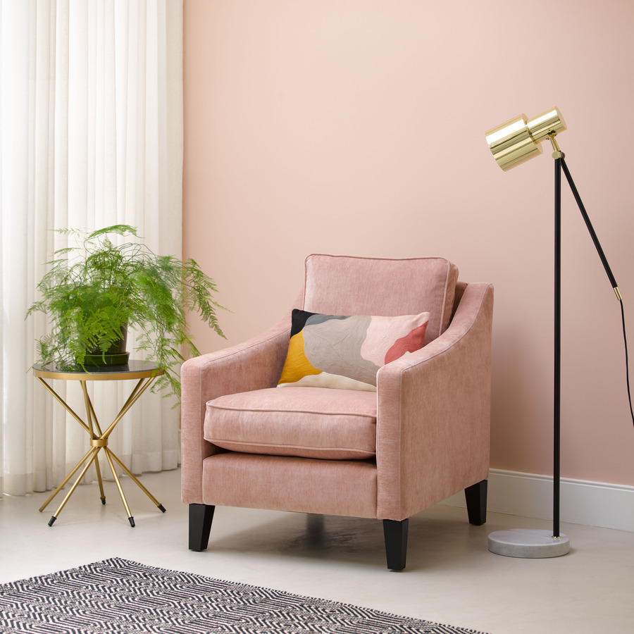
“If you are going to paint a whole room in pink, keep it to a paler colour like blush or dusky pink. Stronger, darker pinks can be quite intimidating and overbearing. If you want to use pinks like neon pink or fuschia, use this shade sparingly like a statement sofa or pops of colour in a cushion or piece of art. I always try to pair pink with another colour other than white as this helps it feel less like a baby girl’s room and makes the pink more stylish.”

For a darker palette, stylist and acting interiors editor for the Mail on Sunday, Sally Cullen, styled our Oscar sofa in Dusty Rose cotton matt velvet with a dark accent table, textured armchair, dark velvet accessories, and patterned wallpaper to create a contemporary, sleek space. Choosing a darker velvet such as Dusty Rose is a stunning way to create a sophisticated interior while still making a colourful statement. In fact, Sally believes when it comes to pink, the bolder the better:
“Pink doesn’t have to mean using a light, pastel colour scheme – team your pink with a maximalist wall paper in deep, bold colours and pull no punches!”
Earth tones and warm pinks

Designing an interior space inspired by nature has seen a significant increase in popularity amongst homeowners after a year of being cooped indoors. Shades of beige, brown, yellow, orange, and white are stunningly used to create a tranquil and invigorating space inspired by the elements.
Interior stylist Kyla Magrath, @kylamagrathinteriors, is no stranger when it comes to introducing pink with and earth colour palette:
“I find pink a really grounding colour. It’s soft, warm and goes beautifully with tones from the Earth palette. The lighter shades like blush and rose are almost a neutral and will go with most things, so you won’t tire of it if you are making bold furniture choices.
My personal favourite to pair with pink is most definitely rust and mustard. As I mentioned, these colours are from the Earth palate and when they’re put together just create warm magic. Think of a sunset and how well the colours blend together. You can recreate this with cushions in different tones on a pink sofa like my Teddy sofa, or with by mixing colours of layers in bedding. And if you feel really brave with wall a colour against a piece of furniture.”

Incorporating an earth colour scheme when introducing pink into your home can be easily achieved when you keep in mind Kyla’s golden rule: stick to a warm base.
“Pair pink with stronger colours that won’t make it feel to girly. I tend to avoid lots of pastels together as it just makes everything feel too sugary and sweet. Try a wall in pink first if, you don’t feel brave enough to use in on a piece of furniture and that way you can change it up easily it you decide you don’t like it.
I also try to avoid pinks with a blueish base. They can feel cold and harsh and are much harder to pair with other colours. Stick to corals, salmon, blush, vintage rose which are all warm based pinks. Introducing pink by layering accessories in these shades mean you can easily swap it out if you fancy a change. Pink goes with most colours.”
Pink and blue hues

Interior guru @mrs_k_at_the_bridge doesn’t shy away from making a statement in her interior design. Situating our Isla sofa in Peony cotton matt velvet in her kitchen space, Gill beautifully pairs the fabulous fuchsia with muted blues, warm wood, and textured accessories to create a contemporary, sophisticated space with a burst of beautiful colour.
“We have peony pink velvet in our kitchen living space and I love that it’s a solid, fun and energetic colour – perfect for this busy family space. Our kitchen units are a muted blue/green which provide a calming backdrop for the pop of colour, creating an edgy look for a modern living space. I’ve teamed it with charcoals and off whites in accent chairs and cushions which stops it becoming overpowering and keeps it a little more refined.”
Opting for a dark blue, grey, or green palette is a beautiful way to prevent your interior space from feeling too kitschy and create a warm and refined environment. Complete the look with neutral tones and textured accessories to keep your space light and fresh.


When it comes to the colour pink, there are no rules. Whatever colour scheme you choose can be made chic and sophisticated by layering the space with tones and textures to create depth and interest.
But most importantly, remember pink is not just a colour, it’s an attitude.